Experience design portfolio · Jordache MacKenzie
I turn complex problems into human-centred digital services
Selected artefacts from government and enterprise work — UX, service design, product UI, and AI-native experiences.
- Portfolio
- Experience design
- Drawn
- J. MacKenzie
- Rev
- B
- People served
- 2M+
- Years in UX
- 7+
- Practice areas
- 5
- Sectors
- Government, enterprise
From crafted objects to services.
I began in industrial design — drawn to materiality and how crafted objects shape experience. Today I apply those principles to digital products: intuitive, accessible services grounded in real human needs.
This portfolio is organised around practice areas, pairing narrative with artefacts — prototypes, blueprints, research outputs, and live demos you can explore directly.
Understanding users needs
Good design starts with understanding people — their goals, frustrations, and how they actually work.
I use interviews, observation, workshops and other design tools to uncover needs that aren’t always visible. This helps teams move beyond assumptions and make decisions based on real evidence.
These insights shape product direction, improve usability, and help create services that work for the people who depend on them.
Details · 1 project
 Using analytics to guide better user flowswww.govt.nzReadClose
Working at Department of Internal Affairs, one of the main challenges I faced when working on govt.nz was that it was extremely difficult to define or segment your customer bases when your customers are everyone in NZ. If we wanted to investigate how a certain page or flow in the site was working, finding enough people to do qualitative research with to be able to provide valuable insights was tough.
I knew we had a lot of rich quantitative data in Google Analytics, but getting it out and using it in a way that could be used to start to communicate meaning was not easy. This was when I decided to introduce to the team data-driven user flows - I trawled through the analytics, and used available data points to start to paint a picture of how users were moving through the site.
These became a great tool for communicating user patterns and behaviours to the team and we were able to use them as a starting point for further research and design. Some examples of these are below:
Loading the Figma file…
Loading the Figma file…
Making sense of complexity
Many of the services I’ve worked on exist within complex ecosystems — multiple systems, stakeholders, constraints, and legacy processes.
I use journey mapping, service blueprints, and systems thinking to create shared understanding and identify where change will have the greatest impact.
By bringing clarity to complexity, I help teams see the bigger picture and make better, more confident decisions.
Details · 1 project
 Mapping the first-year learner journeyBCITO · 2025ReadClose
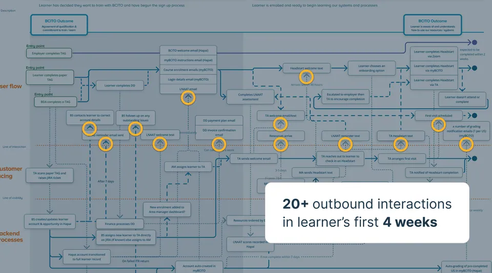
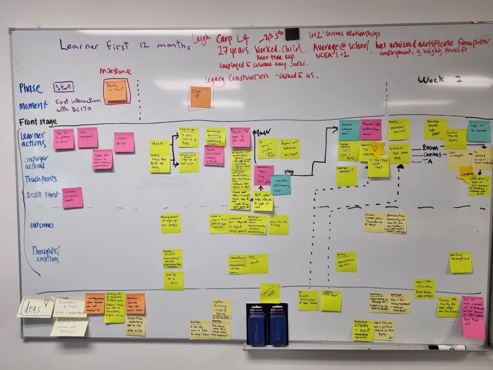
While working at BCITO we had been going through a large amount of organisational change for a long time, this had led to the business losing connection between the different areas and our learner satisfaction scores were trending down, our drop-off in the first 12 months was increasing, but we were unable to determine why.
I worked with different stakeholders across the business who interacted with our learners during their first 12 months to uncover the different touchpoints that learners have with our business as a whole.
There were a large number of insights uncovered through the development of this service blueprint, which gave the organisation tangible action points to begin to address some of their learner experience / retention issues.
It has also been an invaluable tool for contextualising the different digital touchpoints, how they interact with other parts of the user journey and has given us something to refer to when looking at understanding / improving specific user flows. The full service blueprint is below:
Loading the Figma file…
Designing intuitive experiences
My goal as a designer is to make complex tasks feel simple, intuitive, and accessible.
I translate user needs and product requirements into thoughtful interaction designs, prototypes, and interfaces that support people in achieving their goals with confidence.
This work balances usability, accessibility, and technical constraints to deliver experiences that work in the real world.
Details · 3 projects
 Guiding users through complex data structuresmarketplace.govt.nz · 2021ReadClose
The quarterly spend table provides government suppliers with information on where contracts are being supplied and how much funding is being spent across the different categories. We had feedback that the original page layout was unclear and was making it difficult for them to know where to expand their service offerings.
We were unable to talk directly with the users of this page for this work, instead working with an internal SME who was able to give us guidance on what the priorities, pain points and key tasks being completed through this and adjacent content pages of the Marketplace website. The key pain points were:
- users were unsure what was included in the totals
- there was no historic totals or change % for them to be able to contextualise the current quarter’s spend
- the columns were laid out in a way that made it unclear how the individual service categories applied to the higher-level structures
The redesign resolved these issues by the addition of additional guiding text, a stat block summarising the high-level contextual data points, and a single column layout grouping the different service categories with just a single higher-level grouping layer.
Feedback that we got was that this was a significant improvement to clarity and usability for the suppliers.
Loading the Figma file…
 Enhancing customer value by streamlining staff workflowsBCITO · 2024ReadClose
While I have worked on a large number of projects / initiatives this is one of the best examples of where I have been involved from product inception all the way through to delivery / continuous development and integration into business. This started as an invite to a workshop a group of business stakeholders were holding - they were looking at introducing Microsoft OneNote as an additional software tool to help solve some complaints from field staff about lack of process, confusion around tooling and assessment requirements.
After attending the workshop, having to this point primarily been focused on external customers, I spent time investigating the tools and processes our field staff used in their day-to-day. I discovered that the systems and processes were many and, after field research, discovered that these varied widely across the country.
This was causing:
- Inconsistent assessment practices
- Confusion for field staff when they were internally moderated
- Confusion / disruption for learners when their advisor changed
- Inconsistent customer experience for our learners when engaging with our staff on their regular visits
- Poor results from our governing body’s audits
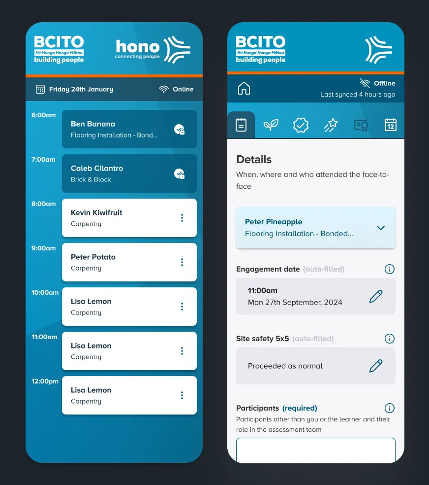
I spent some time pulling together a quick (hi-fi) prototype that provided a single product which covered the largest parts of the field staffs key workflow. This was then demonstrated to leadership as a proposal which they greenlit and gave us 3 months to deliver an MVP. The timeline was tight because we suffering heavy attrition of staff and learners to a new competitor and process complexity was one of the main reasons given for staff departures.
The initial prototype and presentation are presented below:
After the project was greenlit I spent the next month going around the country with another UX designer as support and we did rigorous testing of the prototype and ensuring (within the time limitations) we were able to cover off as many of the key points as possible.
We had no dedicated project team for this but we brought in an external developer to build the application while I co-ran the project and sprint cycles with a product owner of one of the adjacent products. We spent 2 months in development and design iteration, I then ran some workshops across the country, running a short 2 week pilot and a roadshow to demonstrate the new tool to the business.
This culminated in a release 3-4 months after the initial project start with (thanks to the pilot period and lots of comms) a well-received, relatively smooth rollout that significantly reduced workflow complexity and received great feedback from field staff, as well as learners / customers.
 Prioritising user impact under pressurerightcar.govt.nz · 2020ReadClose
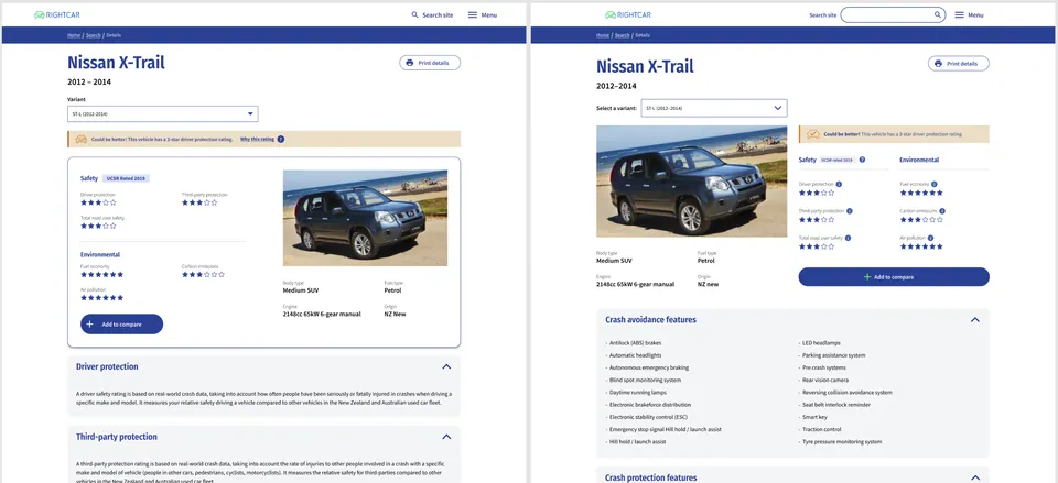
While working at Waka Kotahi NZTA, I was tasked with a full site rebrand, incorporating UX improvements for new site features and a marketing campaign. I had a 4-week timeframe before the launch.
Week 1: I reviewed the existing site and identified pain points. Desk research showed a large portion of users arrived via TradeMe, so I studied its search experience to inform a familiar and intuitive experience on Rightcar.
Loading the Figma file…
Week 2: I rapidly prototyped designs across the five page types, implementing the new brand theme and improving accessibility and usability. I also compared rating systems on the Australian equivalent site and discovered multiple, inconsistent systems - some using 6 stars. I advocated mapping them to a 5-star system to reduce cognitive load, though this wasn’t implemented.
Loading the Figma file…
Week 3: We conducted 2 days of in-person user testing on mobile and desktop with 10 participants. The feedback was consistent, confirming that the design largely worked as intended.
Week 4: I iterated on designs based on testing, focusing on content ordering on the car details page. Users prioritized crash avoidance and protection features and expected car details on the left rather than the right.
The site was developed the following week. I had left the agency before launch, so I couldn’t review the final implementation, but it turned out well.
Testing → Usability feedback + iterations. While the timeline was challenging, it emphasized the value of focused, user-centered design in delivering meaningful improvements quickly.
Improving services over time
I’m passionate about continuously improving services based on feedback, evidence, and changing needs.
I’ve helped evolve products over time, improving usability, accessibility, and consistency while supporting teams to build more mature, user-centred practices.
Details · 1 project
 Refining and evolving products over time to maximise valueBCITO · 2026ReadClose
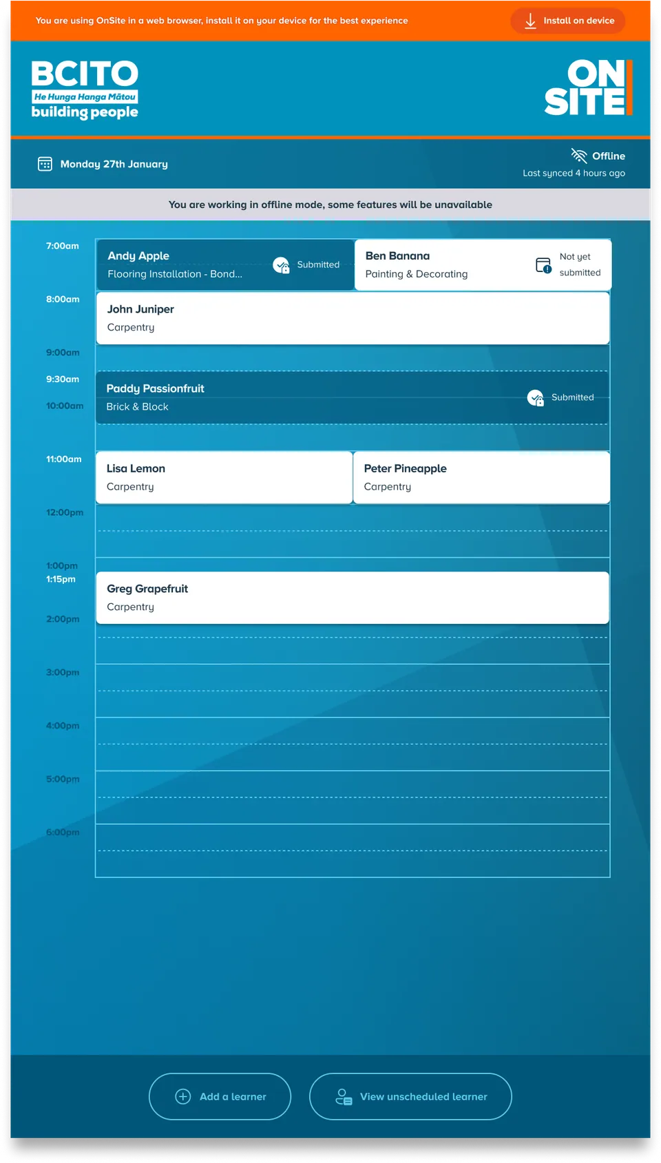
I have led long-term design responsibility for products such as Hono, an in-house field staff engagement and assessment tool. After guiding its MVP rollout in 2024, I have continued to iterate and improve the product, creating a more complete solution for our field staff.
Following launch, we received a flurry of feature requests. I worked closely with the product owner to triage these, and over two years designed and supported features that significantly enhanced the product. These improvements help field staff confidently provide wrap-around support, hold insightful assessment conversations, and deliver knowledgeable guidance.
Learner support referrals
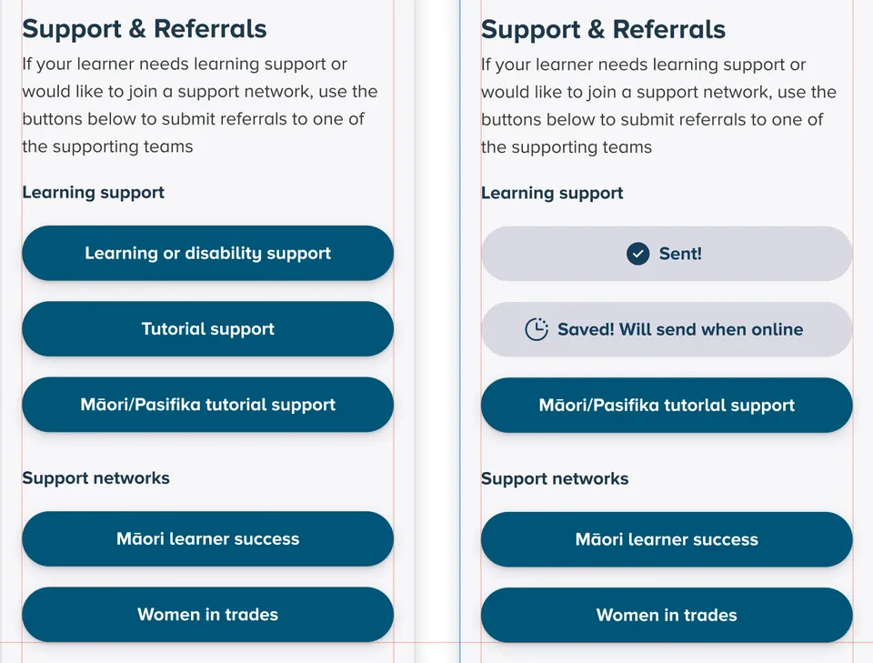
One example is the addition of a referrals process. During a site visit, if an advisor identifies that a learner requires additional support, they can now create referral requests directly within the field app. This replaced an ad-hoc process, established standardized referral pathways, and made it easier for support teams to identify and follow up with learners—ensuring timely access to services.
Loading the Figma file…
Re-architecting a field staff app around a learner-first mental model
Another recent piece of work has involved designing how we migrate our legacy learner management system into our field staff app, enabling advisors to manage learners and engagements in one place.
Having designed and built the field tool, I already had a strong understanding of how advisors used it through an ongoing feedback loop. However, the separate learner management system did not have the same level of visibility, so I conducted interviews and observations to understand when, how and why staff used it, and where it was falling short.
This work has involved re-structuring how learner data is surfaced and interacted with across the app, including introducing a learner-first mental model alongside the existing engagement-first approach. This was a significant shift in the underlying structure of the product, and required careful design iteration and user flow mapping to ensure both models could coexist in a way that felt intuitive.
A key focus throughout was ensuring the new experience matched advisors’ mental models, reducing friction and increasing confidence in using the system. This is especially important at BCITO, where many advisors come from trade backgrounds and have varying levels of digital proficiency. Their primary tool needs to feel simple and reliable, while still being powerful enough to support consistent, high-quality engagement with learners.
This work lays the foundation for a more unified and scalable product, reducing reliance on legacy systems and enabling advisors to manage their relationships and responsibilities in one place.
Creating impact
Ultimately, the success of design is measured by its impact.
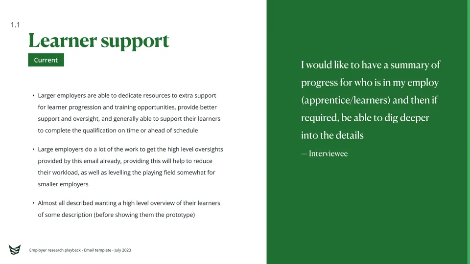
My work has improved experiences for millions of users, streamlined workflows for staff, and helped organisations deliver more effective digital services.
I focus on outcomes — ensuring the work I do makes a meaningful difference for both users and the organisations that serve them.
Details · 1 project
 Meeting users where they are delivers lasting resultsTe Pūkenga · 2023ReadClose
Let’s talk.
Want to talk about product design, design research, collaboration opportunities or just want to say hi?
The work represented here remains the property of the respective organisations and is shared for recruitment and evaluation purposes only.